Arbutus Migratory Bird Sanctuary—Brand Manual
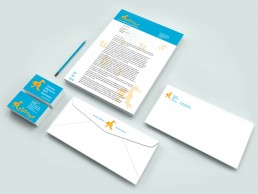
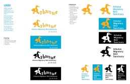
The problem of making Arbutus Migratory Bird Sanctuary’s (AMBS) brand more distinct was solved by creating a logo that references exactly what they do: The logo is a young family of Mallard Ducks. Mallard ducks are one of their resident species that rely on AMBS’s land holding to reproduce each year.
The colours chosen were eye catching and bold. The yellow symbolizes the birds and the blue symbolizes the wetlands. All of the extended pallete continues the theme of birds and wetlands.
The wordmark is also contrasting. The Garamond birds (serif) waddle up on down then the straight plain name in Helvetica Neue (san-serif) which grounds them. This is reinforced the playfulness of the birds and keeps in mind that Arbutus Migratory Bird Sanctuary is for birds and the continuation of their families.
ClientArbutus Migratory Bird Sanctuary – Student ProjectObjectiveBrandingMy RoleBranding, Illustration, LayoutNotesBird brushes courtesy of Xara24. Bird photos courtesy of Wiki Commons.


